


Rabbi Issamar Ginzberg recently noted that, “a website in 2015 is like a phone number in 1985.” Sure enough, in the coming months, more and more people will learn about your shul, school or program — online.
In 2015, you don’t just need a website. You need a site that is referred to as a: “responsive” website.
A responsive website adapts to the device and browser that is being used by the visitor. As such, your website will always look great on a laptop, desktop, tablet or smartphone.
In light of the above, Joe Harrison of Responsive Logos has taken the concept of responsive web design a step further by exploring how brands (and for that matter nonprofits) might adapt for multiple devices and screen resolutions.
To visualize his idea, Joe created scalable versions of well-known logos. The famous Disney logo with its distinctive Cinderella castle, for example, transforms into a simple “Walt Disney” stroke as you resize the browser, and from there on to “Disney” until it is entirely reduced to its essentials when only the signature “D” is left in the smallest screen resolution. Please see below for some examples:
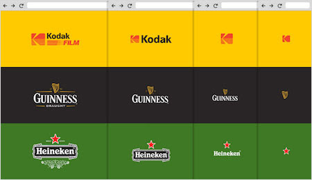
In short, the smaller the logo is, the more timeless it appears.
We encourage you to ask yourself how — in an effort to enhance the branding of your shul, school or organization — you create or adapt your particular logo?