


In the past, we have written all about infographics (see here and here for example) and have even amassed a large collection of Jewish infographics (here and here)!
Nowadays, it seems that everywhere you turn there’s an infographic presenting information to the masses. People love infographics because they easily convey information in a visual way—and best of all, infographics can go viral and increase awareness of a cause, organization, or campaign.
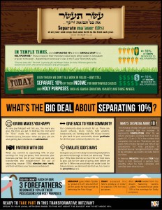
However, there are not many Jewish infographics—and certainly not one that explain to the scholar and layperson all about separating Maaser…until now.
Thankfully, we just received word that — in time for this weeks Torah portion — NCSY created a Maaser infographic for their NCSY Education website.
This infographic outlines the basics of Maaser and why we separate 10% of our income for worthwhile causes and holy purposes.
You can now download the infographic for free here (as a PDF as well) and share it with congregants and students so that they can print out this sheet and use it to better understand and appreciate the Torah portion and why we bother to give Maaser in 2015.